The social media landscape is in constant flux, and one of the platforms facing significant changes is X. Originally known for its straightforward engagement model, X’s recent updates reflect a re-evaluation of its user experience strategy. This article delves deep into X’s latest decision to allow users to enable side-swiping interactions for liking and replying to posts, as well as the implications of this move in terms of user engagement and usability.
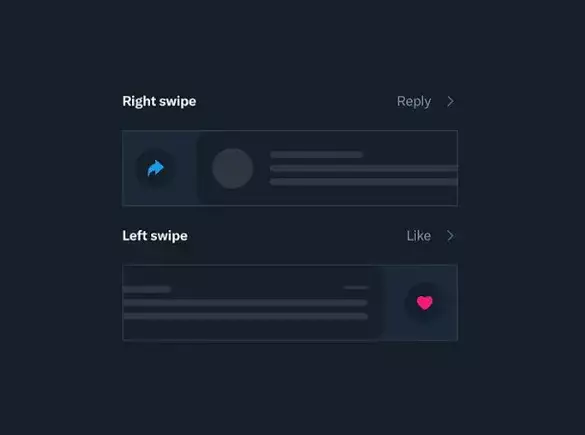
Recently, X engineer May Ly announced a pivotal update for users on iOS platforms, introducing an option to activate side-swiping for reactions to posts. By enabling this feature through app settings, users can engage with posts in a novel way—either by swiping right to reply or left to like. The inclusion of customizable swiping functions, where users can even designate a swipe to bookmark a post or trigger no action at all, is a fresh and flexible approach to user interaction. This new feature, demonstrated in an accompanying video, signifies a strategic pivot from the previously proposed overhaul.
This update emerged after outcry from users regarding the proposed removal of all engagement function buttons, which was linked to the platform’s desire to streamline the user interface. The artistically minimalist approach envisioned by X’s owner, Elon Musk, suggested a clean timeline devoid of distractions, which aimed to enhance the aesthetic qualities of the feed by limiting visual clutter. However, user apprehensions pointed towards potential drawbacks, particularly highlighting concerns that new users might struggle to navigate the platform’s engagement functions without clear indicators.
Instead of fully implementing Musk’s initial stringent approach, X has opted for a more nuanced and experimental strategy. This combination of caution and adaptability is particularly noteworthy. By not enforcing the side-swiping feature as a mandatory change, X allows users to dictate their experience, enabling them to choose whether to engage in this new style of interaction. This decision is also reflective of a growing awareness within the platform to prioritize user comfort and usability.
The revised engagement model, which provides users with flexible interaction options, can be interpreted as an acknowledgment of user feedback—a rare quality in the often rigid operational strategies of tech companies. Not only does this choice foster a sense of autonomy among users, but it can also cultivate an environment where user responses to the new interaction model can be measured and analyzed, ultimately informing further developments.
One of the most intriguing aspects of this update is its potential influence on user behaviors and engagement patterns. While it remains uncertain whether many users will choose to adopt these side-swiping capabilities, the feature presents an opportunity for users to engage differently with content. This could set off a chain reaction, gradually fostering more habitual use patterns that mirror the preferences of the user community.
Furthermore, the possibility of minimizing interaction counts and engagement buttons entirely in the future still lingers. If that does come to fruition, the groundwork being laid through this optional feature could lead to a smoother transition for users. This approach not only paves the way for more organic user adaptation but also opens the door to understanding how users interact in less conventional formats.
As X navigates the complex terrain of user interaction, its latest feature has the potential to redefine how its users navigate the platform. This shift towards greater user choice and an experimental interface may signal a new era of engagement, where user preferences take center stage rather than enforced methodologies. In this light, while X’s long-term goals may still include a more minimalist interface, this cautious, user-driven evolution could ultimately lead to a more robust and engaged user base. The articulation of user preferences could guide not only the platform’s immediate adjustments but also lay the foundation for future modifications that resonate with a broader audience.


Leave a Reply