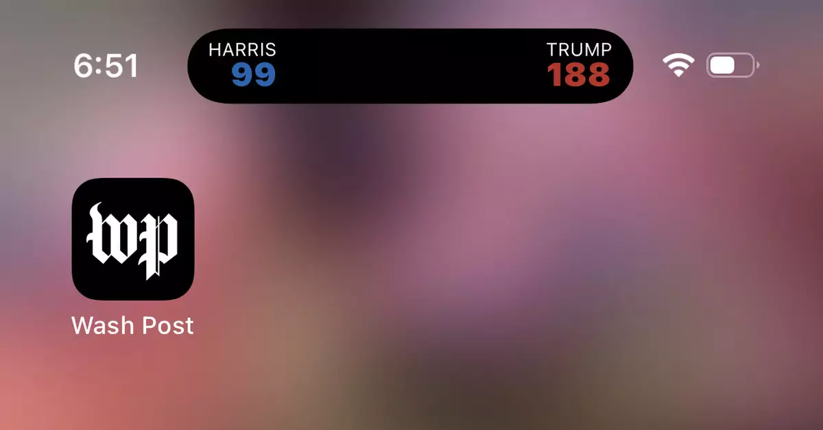
As the 2024 presidential election approaches, technology continues to intersect with politics, sometimes in ways that users neither anticipated nor appreciated. For many iOS users, an unexpected feature from the Washington Post app has emerged that raises questions about user control and notification management. This feature—dubbed the “Electoral College hell-toggle”—provides a live count of electoral votes and updates related to the election. However, the prominence of this feature has sparked mixed reactions among users.
For some users, the implementation of live electoral updates might be viewed as an innovative way to stay informed. After all, who doesn’t want to be kept in the loop regarding national events that could shape the future? Yet, the flip side is that many users are finding this persistent toggle annoying and intrusive. It takes vigor to manage one’s technology and not become a slave to it—especially when it encroaches on personal space in the form of undismissable notifications. The situation illustrates a growing concern: as apps become increasingly sophisticated in how they deliver updates, the line between useful information and unwanted distraction blurs.
In response to the public outcry over the feature’s unwelcome presence, users have sought methods to reclaim control over their devices. Users can disable this notification by navigating to the ‘Settings’ app on their iPhones, locating ‘Apps,’ and specifically managing settings related to the Washington Post app. Although this process involves a few steps—from turning off ‘Allow Live Activities’ to potentially re-enabling them later for those seeking updates—it emphasizes user agency. The ability to opt-in or opt-out is crucial in an era where many tech solutions are designed to engage us incessantly.
The “Electoral College hell-toggle” phenomenon illustrates a more profound issue at play within the software and app development landscape: how do we balance the desire for real-time information with the potential for user fatigue? With various applications vying for our attention, the challenge particularly lies in ensuring that updates are relevant without overwhelming users. Moreover, the presence of similar features in other news outlets, like Apple News, signals that the trend may persist, unless developers heed user feedback.
Ultimately, as technology continues to intertwine with our daily lives, users must remain vigilant and proactive about their engagement with this technology. The electoral toggle can be seen as a double-edged sword—on the one hand, it epitomizes the trend towards hyper-connected informational ecosystems; on the other, it serves as a reminder of our right to opt out when necessary. Users should strive for balance, ensuring technology serves them rather than the other way around. In navigating myriad notifications, we must choose to engage with information that enriches our understanding and political engagement without the burden of unwanted interruptions.


Leave a Reply