In a daring move, Apple recently unveiled its Liquid Glass design language, a revision of its signature aesthetic that has been met with mixed reactions following its announcement at WWDC 2025. This overhaul affects all devices across the Apple ecosystem and is poised to redefine user interactions with mobile technology. While the innovation is undeniably sleek, the initial reception highlights the tension between pushing boundaries and ensuring user comfort in a familiar space.
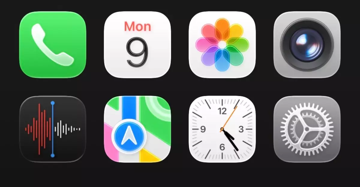
The Liquid Glass design attempts to combine transparency and fluidity, presenting app icons, tab bars, and text magnifiers in a way that seems to float above the device’s backdrop. This development is meant to create a sense of depth, allowing users to visually engage with their backgrounds in a new way. However, upon first glance, many users, including myself, might find the shift jolting, akin to stepping from a stable ground onto shifting sand.
A Roller Coaster of Aesthetics
As I explored the functionality of the latest iOS 26 developer beta, I discovered that while the vision behind Liquid Glass is intriguing, its execution is still in progress. The design has brought a certain shininess to the user interface, making everything appear more modern yet cluttered. Translucency, a hallmark feature of this aesthetic, creates a beautiful visual cadence but often at the expense of readability and usability.
Take, for instance, the Control Center. Instead of being a clean and coherent interface, it came off as chaotic amidst the bubbling elements, particularly for users opting for a subdued color palette. This stark contrast between clarity and complexity feels counterintuitive for a company that prides itself on intuitive design. It’s clear that Apple has placed a high priority on aesthetic innovation, but the balance with functionality requires reevaluation.
The Nuances of Interaction
Apple has a history of delivering user interfaces that afford an enchanting experience, often laden with small touches that separate it from competitors. The Cloud-like animations in the Clock app, for example, offer a delightful interactivity that reinforces the floating nature of the components. The animation behaves as though water droplets are skimming over the surface, responding to user interactions in a way that is at once breathtaking and slightly disconcerting.
Yet, this new approach comes with its own set of complications. Transitional effects and unique button shapes, although meant to enhance engagement, can disorient users accustomed to more straightforward designs. For instance, the revisions to the keyboard and the spacing issues within the Settings app create a sense of unease that belies Apple’s reputation for meticulous attention to detail.
A Leap of Faith or a Misstep?
My journey through the iOS 26 beta has been a rollercoaster of reactions. Initially, I found the Liquid Glass look unsatisfying, which was surprising, especially since I’ve previously embraced significant design shifts without hesitation. As a longtime observer of Apple’s design trajectory, I expected more cohesive integration—from form to function. Yet, after multiple sessions using the updated interface, I found my initial aversion transforming into curiosity. Perhaps there is merit in the boldness of the Liquid Glass approach, even if it feels clunky at times.
A significant concern I have is with the spacing and overlapping layouts, particularly in essential functionalities like the Messages app or within Settings. These areas feel bloated and confusing, with too much white space that serves more as a hindrance than a design enhancement. However, the beauty of Apple’s iterative process means that I remain hopeful for refinements and adjustments leading up to the official launch later this fall.
While Apple’s Liquid Glass design boldly attempts to marry elegance with utility, it simultaneously raises questions about the viability of such a departure from established norms. Only time will tell if Apple can strike the right balance between aesthetic ambition and user-friendly functionality.
Leave a Reply